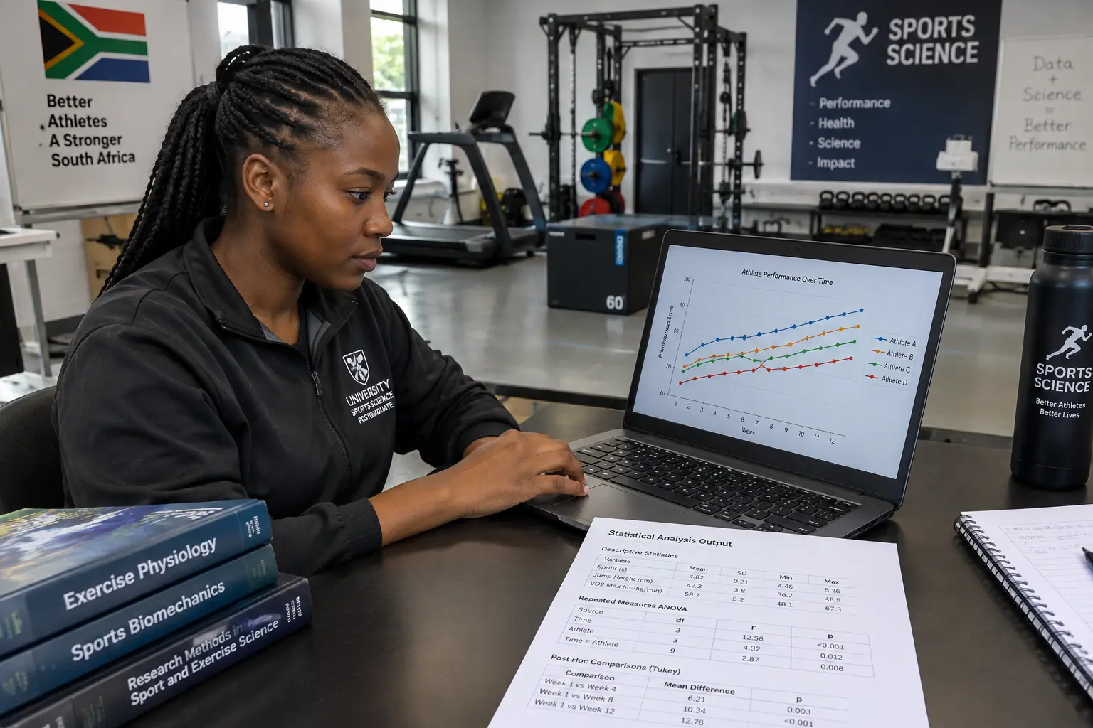
| Data type | Best presented as | Why | Common sports-science example |
|---|---|---|---|
| A single comparison between two conditions or groups | A table with means, SD and the test statistic | Precise values matter more than a visual trend | Pre- vs post-intervention VO2max |
| A trend over multiple time points | A line graph | The shape of change over time is the finding | Weekly sprint-time change across a training block |
| Agreement between two measurement methods | A Bland-Altman plot | Shows bias and limits of agreement, not just correlation | Field GPS speed vs laboratory timing-gate speed |
| A single athlete or small squad tracked individually | A single-subject or small-N graph, not a group mean | Averaging masks individual response variability | An individualised load-monitoring case study |
| Categorical or ranked outcomes | A bar chart or ranked table | Comparing discrete categories, not a continuous trend | Injury type by playing position |
A South African sports science dissertation is judged partly on whether the results chapter presents data in the form the data itself calls for, not whichever chart type is easiest to build in the analysis software’s default settings. Five data types, the table or figure that fits each, and the reporting conventions specific to sports and exercise science — effect sizes, measurement-agreement plots, individual-response presentation and the sphericity checks a repeated-measures design needs before an examiner will accept the reported statistic at face value.
Report the effect size, not only the significance level
Sports science results chapters lean more heavily on effect sizes than many other fields, because a statistically significant difference in a small elite-athlete sample can still be practically trivial, and a non-significant result in an underpowered squad-sized study can still be practically meaningful. Cohen’s d is the standard effect-size statistic for a two-group or pre-post mean comparison in this literature, reported alongside (not instead of) the p-value. An illustrative sentence, with invented numbers: “sprint time improved significantly following the eight-week intervention (t(19) = 3.42, p = 0.003, d = 0.76), representing a medium-to-large effect.” The general logic for choosing the underlying statistical test in the first place follows the same decision framework covered in the site’s guide to choosing the right statistical test for a dissertation; sports science’s specific addition is that the effect size, not the significance level alone, is what an examiner expects to see interpreted for practical meaning.
Use a Bland-Altman plot when comparing two measurement methods, not a simple correlation
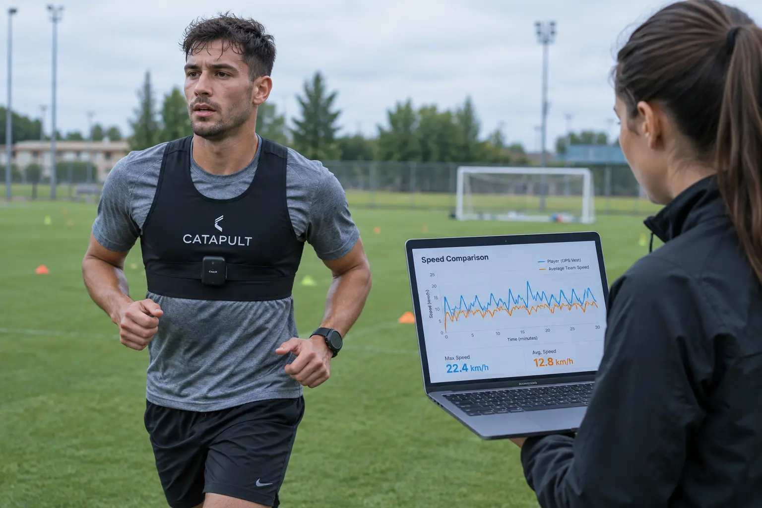
A common sports science design compares a cheaper or more practical field measure (a GPS unit’s estimated speed, a wearable’s heart-rate reading) against a criterion laboratory measure, and the temptation is to report a Pearson correlation between the two as evidence of agreement. A high correlation is not the same as good agreement — two measures can correlate strongly while one is consistently, systematically higher than the other across the whole range, which a correlation coefficient does not detect. The Bland-Altman plot, which graphs the difference between the two methods against their mean, is the standard tool in this literature for showing both the average bias between methods and the limits of agreement, and a methods-comparison chapter that reports only a correlation coefficient is missing the analysis an examiner familiar with the field will expect.
Do not average away an individual athlete’s response in a small-squad study
Group-mean reporting is standard for a large-sample study, but sports science frequently works with squad sizes too small for a group mean to be the most informative summary, and coaching-applied research specifically often cares about individual response variability — not every athlete responds to the same training load the same way, and a group mean can hide a result where half the squad improved substantially and half did not change at all. Where your research question is genuinely about individual response, present individual athlete data points or small-N case graphs alongside (or instead of) a group mean, and say explicitly in your results chapter why an individual-level presentation better answers your specific research question than a pooled average would.
How should a training-block time series be presented?
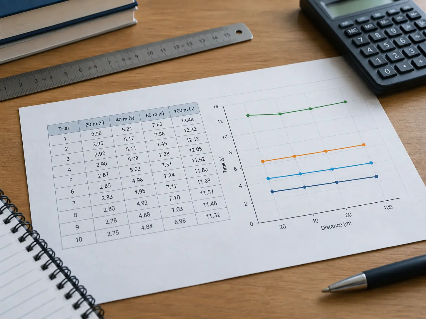
A line graph tracking a variable (sprint time, jump height, a wellness score) across sequential weeks or sessions of a training block is the standard presentation for this kind of design, with the x-axis showing time and the y-axis the measured variable, error bars showing variability at each time point, and any intervention or training-phase change marked clearly on the timeline itself. Report the specific statistical test used to assess change over time (repeated-measures ANOVA is common for this design, though check the assumptions against your own data structure using the general test-selection logic in the site’s guide above) in the results text, not only in a table caption, since a reader following the graph in isolation should still be able to find the statistical basis for any claimed trend.
How do I turn SPSS or R output into a sports-science results chapter?
The general discipline of not simply pasting raw statistical-software output into a results chapter applies here as everywhere else: rebuild each table to the format your journal or faculty expects, report each test correctly in running text, and keep interpretation for the discussion chapter rather than mixing it into the results themselves. The site’s general guide to turning SPSS output into a results chapter covers this discipline in depth; sports science’s specific addition on top of that general guidance is the effect-size and Bland-Altman conventions covered above, which a generic results-chapter guide does not mention.
A worked before-and-after table caption
Weak caption: “Results.” This tells a reader nothing they could not get from the table itself, and does not let the table stand alone if extracted. Corrected caption (illustrative): “Table 4.2: Mean (±SD) 20m sprint time at baseline and post-intervention for the training group (n = 12) and control group (n = 11), with between-group effect size.” The corrected version names the specific variable, the groups and their sizes, the time points, and signals that an effect size is reported — everything a reader needs to know what the table shows before reading a single number in it.
How should a repeated-measures design report sphericity and correction?
Where a repeated-measures ANOVA is the chosen test for a training-block time series, examiners expect Mauchly’s test of sphericity reported before the main ANOVA result, since violating this assumption (a real possibility with more than two repeated time points) requires a correction — Greenhouse-Geisser is the standard correction reported when sphericity is violated, and the corrected degrees of freedom, not the uncorrected ones, are what should appear in the final reported statistic. A results chapter that reports an uncorrected repeated-measures ANOVA without checking sphericity first is a specific, checkable gap, distinct from the general test-selection logic that applies across every dissertation field.
What about non-parametric alternatives for small squad sizes?
Small squad sizes (a common constraint in university and provincial-level sports science research, where a full elite training group is rarely available) frequently fail the normality assumption parametric tests require, and a defensible results chapter checks this explicitly rather than defaulting to a parametric test out of habit. The Wilcoxon signed-rank test is the standard non-parametric alternative to a paired t-test for a small pre-post comparison, and the Friedman test is the non-parametric alternative to a repeated-measures ANOVA across more than two time points; both report a different effect-size statistic (commonly r, calculated from the test’s z-value, rather than Cohen’s d) and should not be reported using the parametric effect-size convention. State plainly in the results chapter why the non-parametric route was chosen — the specific normality check result, not just a general statement that the sample was small.
One recommendation
Match the presentation format to what the data structure actually is — a table for a precise single comparison, a line graph for a time trend, a Bland-Altman plot specifically for a measurement-agreement question, and individual data points rather than a pooled mean where individual response variability is the point of the study. Report an effect size alongside every significance test, and write every table and figure caption specific enough to stand alone.
How does this connect to writing the discussion chapter that follows?
Once results are presented in the right format with effect sizes reported, the discussion chapter’s job is to interpret what those effect sizes and trends actually mean for training practice or theory — a separate task from the results chapter itself, which the site’s general guide to writing the discussion chapter of a dissertation covers, including how to handle a result that contradicts the existing literature, a genuine possibility in a small-sample sports science study where effect sizes are often the more honest headline than the significance test alone.
Building tables and figures that hold together across a whole results chapter
Keeping table and figure numbering, caption style and statistical reporting format consistent across a full results chapter — while choosing the right presentation format for each different data type in it — is exactly the kind of structured drafting work Tesify helps with, while every number and every judgement about your own data stays yours and the dissertation stays 100% written by you. Draft your results chapter with Tesify.
Frequently asked questions
Should I always report both a p-value and an effect size?
Yes — sports science examiners specifically expect an effect size alongside any significance test, since a significant result in a small elite sample and a practically meaningful result are not automatically the same thing.
What is the difference between a correlation and a Bland-Altman plot?
A correlation shows whether two measures move together; a Bland-Altman plot shows whether they agree in absolute terms, revealing a systematic bias between methods that a correlation coefficient alone would not detect.
Is it acceptable to present only individual athlete data with no group statistics at all?
It depends on your research question — where individual response variability is genuinely the point, individual-level presentation is appropriate, but most designs still benefit from reporting group-level descriptive statistics alongside individual data, not instead of them.
Which statistical test is standard for a training-block time series?
Repeated-measures ANOVA is common, but check its assumptions (sphericity, normality) against your own data structure using the general test-selection logic covered on this site, rather than assuming it fits every time-series design by default.
Do error bars on a graph need to be explained in the caption?
Yes — state explicitly whether error bars represent standard deviation, standard error or a confidence interval, since the three convey different information and an unlabelled error bar is ambiguous to a reader.
How many decimal places should I report for a sports-science measurement?
Match the precision your measurement instrument actually supports, the same principle that applies across any field’s dissertation — a hand-timed sprint should not be reported to the same decimal precision as an electronic timing-gate reading.
Should tables or figures come first when a chapter reports the same data both ways?
Generally avoid reporting the identical data in both a table and a figure within the same chapter; choose whichever format better serves the specific finding, and use the other only when it adds genuinely different information.
What if my supervisor asks for confidence intervals instead of, or alongside, p-values?
Report both where your faculty or journal target expects it — a confidence interval around the effect size gives a reader a sense of precision a bare p-value does not, and many journals now ask for confidence intervals alongside, not instead of, traditional significance testing.